If you’re looking to start an online business or supercharge your existing one, you’re in the right place. In this guide, we’ll unravel the mystery of landing pages, understand their significance, and discover best practices to skyrocket your conversion rates.
Table of Contents
What Is a Landing Page?
A landing page is like the front door of your digital business, the virtual handshake with your potential customers. It’s a standalone web page designed for a specific purpose, usually to promote a product or service. Think of it as a focused, action-oriented destination.
Your landing page should be laser-focused, with one clear call-to-action (CTA). This might be signing up for a newsletter, downloading an ebook, or making a purchase. It’s where you want your visitors to take a specific action, and you need to make it crystal clear.
Why Are Landing Pages Important?
In the vast landscape of the internet, your landing page is your beacon. Here’s why it matters:

- Conversion Powerhouse: Landing pages are built to convert visitors into customers. They are crafted with a purpose, and that purpose is to get your visitors to take action. According to a study by WebFX, the average conversion rate for landing pages across industries is between 2% and 5%. This underscores the significance of crafting compelling landing pages that drive conversions
- Targeted Messaging: Unlike your homepage, which caters to a broad audience, a landing page hones in on a specific message. This means you can tailor your content to a particular segment of your audience, making it highly relevant.
- Data Goldmine: Landing pages are excellent sources of data. You can track who visits, how long they stay, and whether they convert. This data helps you refine your marketing strategy.
- Boosts SEO: Having dedicated landing pages optimised for specific keywords can improve your website’s overall SEO ranking.
- A/B Testing: You can experiment with different layouts, CTAs, and content on landing pages to see what resonates best with your audience.
Now, let’s distinguish landing pages from their close cousin, the homepage.
Home page vs. Landing Page
Your homepage is like the front porch of your digital home—it’s welcoming and gives visitors an overview of your entire house (your website). On the other hand, a landing page is more like a room inside, designed for a particular purpose. Here’s a quick comparison:
Home Page
- General introduction to your brand.
- Navigation to various sections.
- Multiple CTAs for different actions.
- Provides an overview.
Landing Page
- Specific message and CTA.
- Minimal navigation options.
- Focused on a single goal.
- Eliminates distractions.
For instance, if you’re running a special promotion for web hosting services, you’d create a landing page dedicated to that offer, rather than sending visitors to your homepage where they might get lost in the digital maze.
Different Types of Landing Pages
Landing pages come in various flavours, each suited to different purposes. Here are a few common types:
- Click-Through Landing Page: This type is designed to warm up visitors and lead them to a product or service page. It’s like a virtual salesperson, offering more details before making the pitch.
- Lead Generation Landing Page: If you’re looking to expand your email list, this is your go-to. It offers something valuable in exchange for contact information—like a free ebook or a webinar registration.
- Squeeze Page: Short, sweet, and laser-focused on a single CTA—usually capturing email addresses. These are often used for quick promotions.
- Sales Page: When you’re ready to sell a product or service directly, this type of landing page is the key. It provides all the information a potential customer needs to make a purchase decision.
- Viral Landing Pages: These are crafted to generate buzz and excitement. They often contain viral content, like contests, quizzes, or challenges, and encourage social sharing.
Each type serves a different purpose, so choose the one that aligns with your goals. And now, what’s better than diving into some real-world examples?
Good Landing Pages Examples
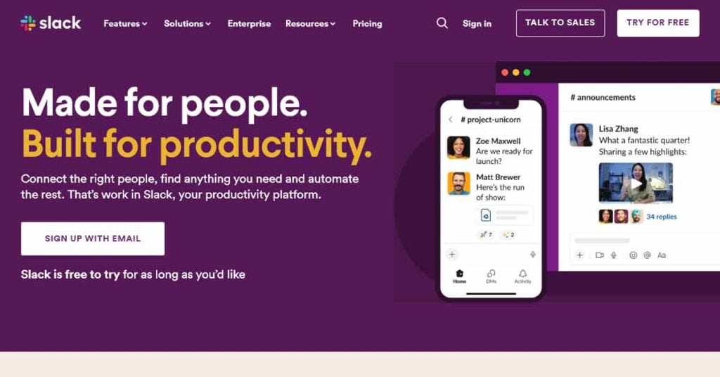
Example 1: Slack

CTA: “Sign Up With Email”
Why It Works: It has a clear and enticing CTA, an explainer video, and testimonials for social proof. Plus, the “free to try for as long as you’d like” supporting text part is always a crowd-pleaser.
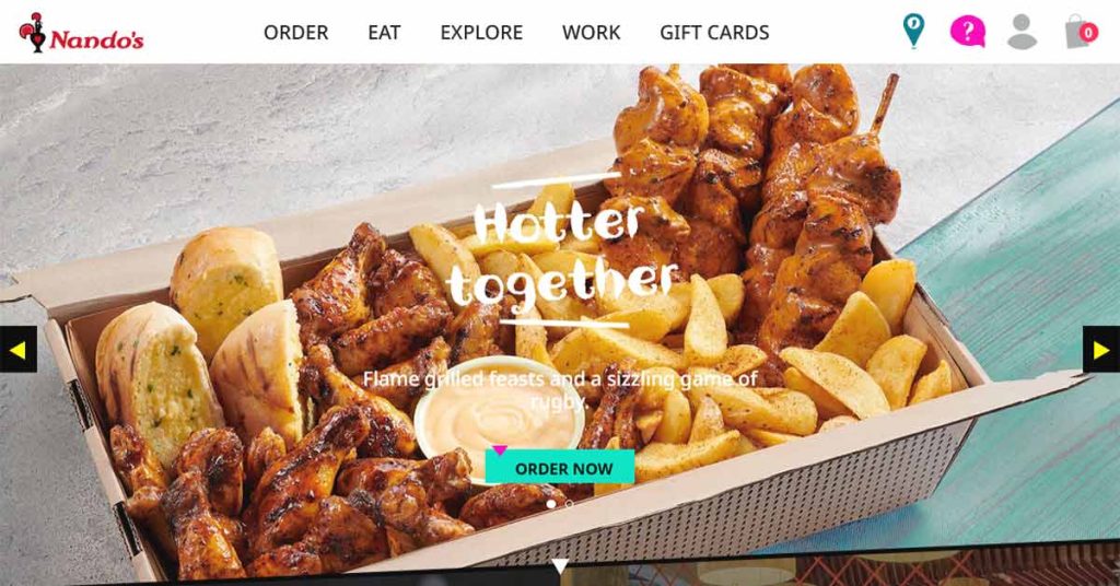
Example 2: Nandos

CTA: “Order Now”
Why It Works: It features mouthwatering visuals, ignites your cravings, and provides a clear and simple action to take. It’s all about savoring the flavor.
These examples showcase the diversity of landing pages and how they can effectively convey their unique messages. But what separates a good landing page from a great one? Let’s explore some best practices.
Landing Page Best Practices
Creating an effective landing page is part art, part science. Here’s the science bit—the best practices that can help you craft landing pages that convert like crazy:
- Clear and Compelling Headlines: Your headline should grab attention and convey the essence of your offer.
- Engaging Visuals: Use high-quality images or videos that support your message. Visuals can be the difference-maker.
- Concise Copy: Keep it short and sweet. Explain the benefits, not just the features, and show how it solves a problem.
- Trust Signals: Incorporate trust elements like customer testimonials, security badges, or awards.
- Mobile Optimisation: Ensure your landing page looks and functions perfectly on mobile devices. This is non-negotiable in our mobile-first world.
- A/B Testing: Continuously test different elements like CTAs, colours, and copy to find the winning combination.
- Fast Loading: Host your landing page with a provider like MCloud9 with LiteSpeed web hosting for blazing-fast loading times.
- CTA Button: Make sure your CTA button stands out with contrasting colours and action-oriented text.
- Limited Navigation: Minimise distractions. Don’t give visitors too many choices. Keep the focus on the CTA.
- Privacy Assurance: If you’re collecting personal information, assure visitors that their data is safe and won’t be misused.
Optimising Your Landing Page for Better Conversion Rates
Now that you have the fundamentals down, let’s turn our attention to optimisation.

SEO for Landing Pages: To maximise your landing page’s visibility, optimise it for search engines. Use relevant keywords, meta tags, and ensure you choose fast web hosting provider for page loading speeds.
Conversion Rate Optimisation (CRO): CRO is a continuous process. Monitor your landing page’s performance and make data-driven changes.
Design Elements: Keep your landing page design clean and uncluttered. Use white space effectively to guide the visitor’s eye towards the CTA.
Right Tools: Leverage landing page builders or CMS platforms that simplify the creation and management of landing pages, like MCloud9’s user-friendly website builder.
Using Landing Pages in Your Marketing Campaign
Your landing pages are integral to your marketing strategy. Here’s how to make the most of them:
- Social Media Posts: Share your landing page on social media platforms to drive traffic.
- Email Marketing: Include landing pages in your email campaigns.
- Paid Ads: Create dedicated landing pages for your ad campaigns. This aligns the user’s journey and improves conversion rates.
- Content Marketing: Use landing pages to offer valuable content like ebooks, guides, or whitepapers in exchange for email sign-ups.
- Analytics: Regularly analyse your landing page’s performance using tools like Google Analytics.
FAQ for Landing Pages
What is the importance of landing pages?
Landing pages are designed to generate leads and encourage users to take a specific action, like signing up for a free trial or providing their contact information. They serve as a standalone page that focuses on a specific offer or campaign.
How does a landing page differ from a homepage?
A landing page is a standalone page with a specific goal, while a homepage serves as the first page users see when they visit a website. Landing pages are designed to convert visitors into leads or customers, while homepages are more comprehensive and provide an overview of the entire website.
Can I have multiple landing pages for my website?
Yes, having multiple landing pages can be beneficial. You can create different landing pages for different offers or campaigns, targeting specific audience segments. This allows you to tailor your messaging and design to maximise conversions.
What are the key elements of a successful landing page?
A successful landing page needs to have a clear and compelling headline, a high-converting call-to-action, well-designed visuals, persuasive copy, and a form to capture contact information. It should also have a clean and user-friendly layout, be optimised for mobile devices, and load quickly.
How can I make a landing page that converts?
To make a landing page that converts, you should focus on creating compelling copy and visuals, using persuasive language, offering something of value (such as a free trial or downloadable content), and making it easy for people to take action. It’s also important to test and optimise your landing page based on user behaviour and feedback.
Do longer landing pages perform better than shorter ones?
The length of a landing page depends on the complexity of your offer and the amount of information needed to persuade visitors to convert. Some studies have shown that longer landing pages with more detailed content can perform better, while others have found that shorter and more concise landing pages lead to higher conversions. It’s best to test different lengths and formats to see what works best for your specific audience.
What should be included in the copy of a landing page?
The copy of a landing page should clearly communicate the value of your offer, explain how it solves a problem or meets a need, address any objections or concerns, and create a sense of urgency. It should be concise, persuasive, and written in a language that resonates with your target audience.
Can the background of a landing page impact its performance?
Yes, the background of a landing page can impact its performance. A visually appealing and relevant background can grab attention and create a positive impression. It should complement the overall design and highlight the key elements of your offer. Avoid using distracting or cluttered backgrounds that can take away from the main message of the page.
How can I drive traffic to my landing page?
There are several ways to drive traffic to your landing page. You can promote it through digital marketing channels such as email campaigns, social media advertising, search engine optimisation, and paid search advertising. You can also include links to your landing page in blog posts, guest articles, and other content on your website.
In Conclusion
You’re now equipped with the knowledge to create landing pages that work wonders for your online business. Remember, landing pages are your digital sales force, and with the right strategies, your conversion rates can skyrocket.
So, go ahead, experiment, and make your landing pages shine. Whether you’re promoting your business, capturing leads, or selling products, a well-crafted landing page can be the game-changer your online venture needs. Here’s to your success!
If you’re looking to quickly design a landing page with no coding skills, check out our easy drag-and-drop website builder.


